Client: Docker
Timeline: Neverending
Roles: Lead Product Designer, Visual Design
Prototypes:
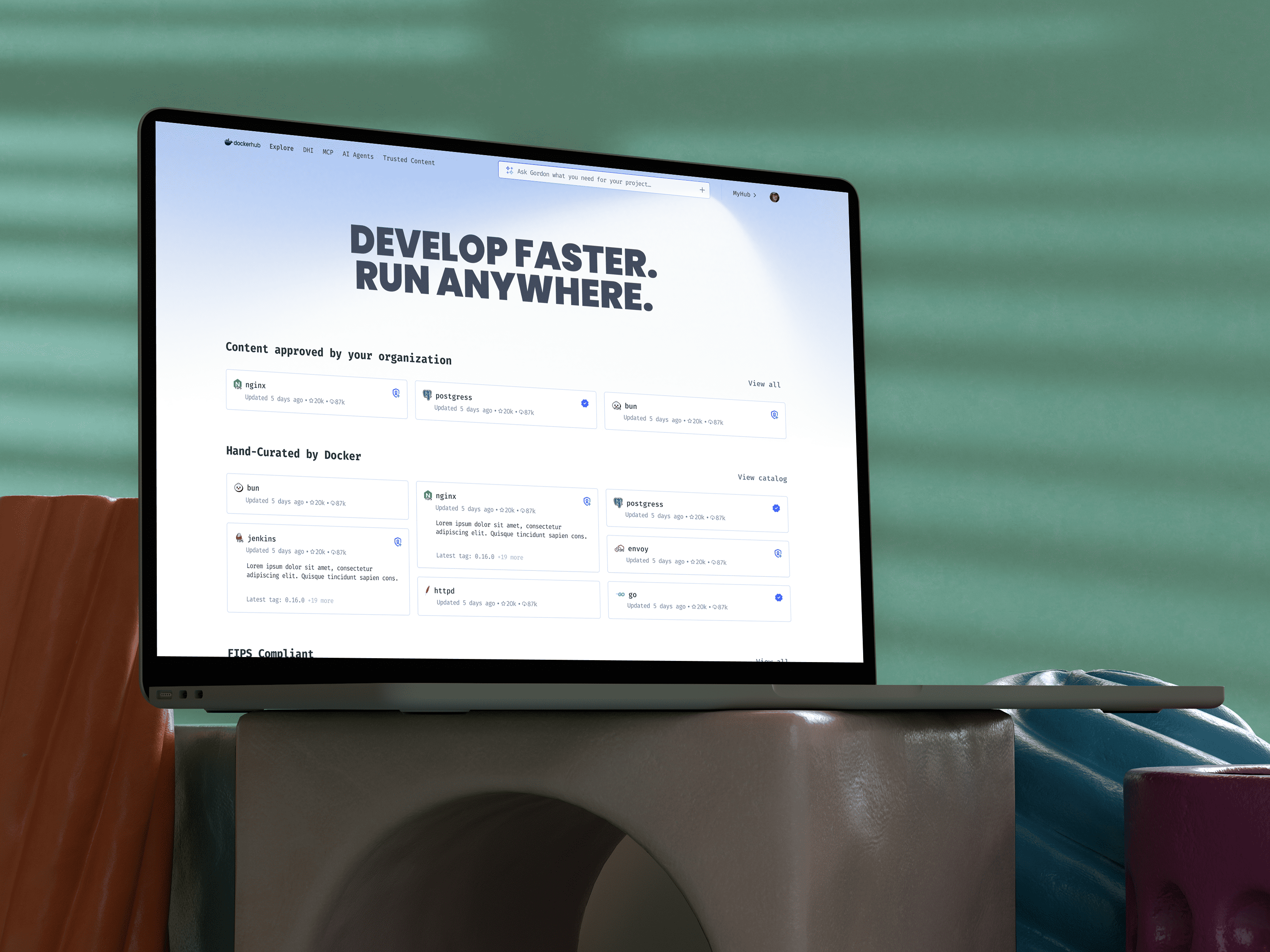
Docker Hub is old, and it shows. The interface feels dated, the information architecture is messy, and years of different teams layering on features have left it disjointed. There have been multiple attempts to fix this over the years, but none of them ever really stuck.
I was involved in a few of those earlier efforts. Most of them took the form of short-lived tiger teams that eventually lost momentum. Late last year, I decided to push on this again. I started by creating high-fidelity mockups to spark conversation, and this time it landed. In November, my manager gave me dedicated time to explore the problem space.
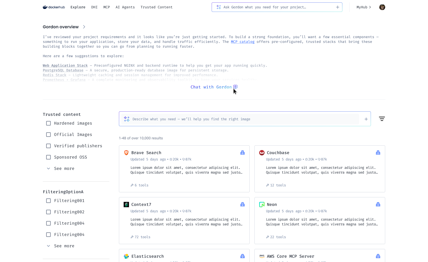
What started as a Hub vision quickly evolved into something broader. It became clear this was not just about Hub, but about how Docker should position all of its web products in a more cohesive way. The goal was to create a better overall experience, tell a clearer platform story, reduce friction, reinforce value, and make it easier to scale to new surfaces over time.
Docker has grown into a broad platform, but our web experience has not grown with the same level of cohesion. As new products and surfaces have been added, users are forced to piece together context across Hub, App, Admin, Scout, Cloud, and Docs just to understand what is going on.
This fragmentation shows up at the worst possible moments, especially around sign-in. Users now land on App Dot (app.docker.com) instead of Hub. When App Dot (app.docker.com) first shipped, it saw very few meaningful iterations due to shifting company priorities. As a result, many users now arrive after sign-in to something that feels more like a styled wiki than a clear starting point for their work.
This initiative started as a Hub-focused vision, so that’s where I began. During the kickoff, we agreed that the first step should be a full inventory of Hub’s information architecture.
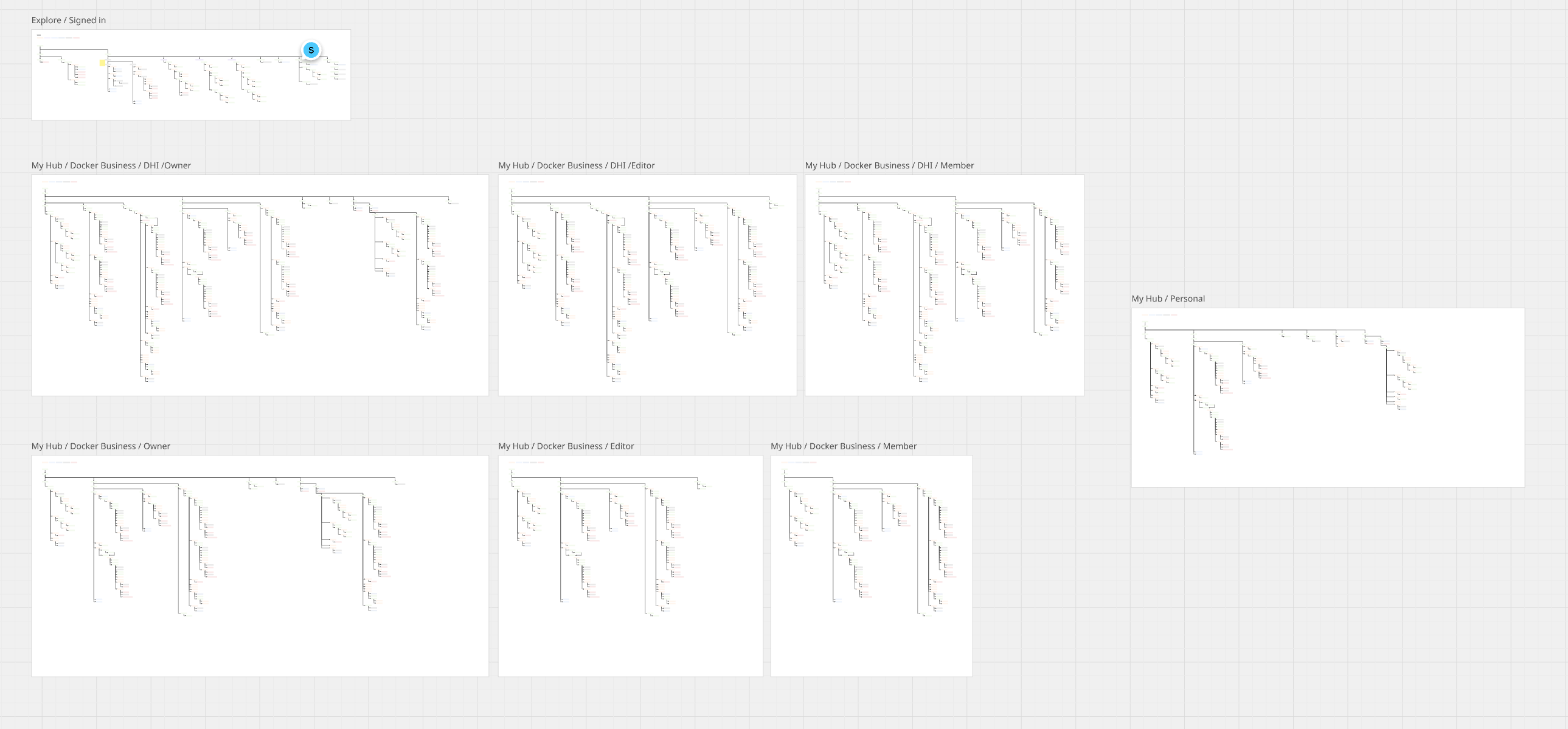
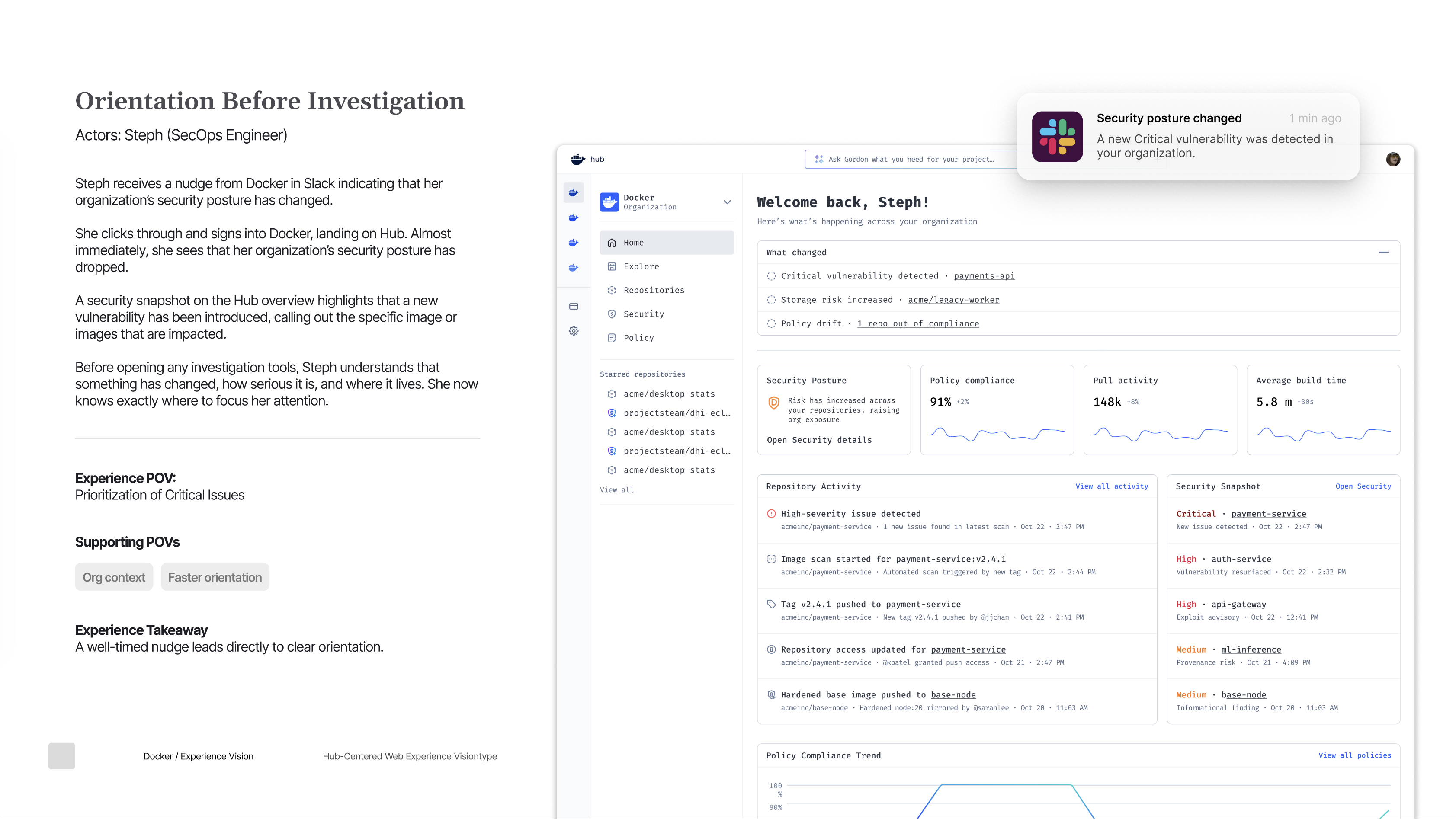
That work took time. Hub is bloated, supports multiple roles with different access levels, and had just introduced new pages and navigation as part of the Hardened Images launch. As I cataloged everything, patterns started to emerge. I saw clear choke points, inconsistencies, and areas that simply no longer made sense. I documented these findings in an audit and shared them with the team.
In the next working session, I was asked to look at the relationship between Hub and App Dot. This was a sensitive topic. When App Dot was first conceived as the post-sign-in destination, there were strong arguments that Hub should play that role instead. App Dot never fully became what it was meant to be, largely due to shifts in company direction.
To ground the conversation, I pulled usage data from Heap to understand two things: how users get into Hub, and what they do once they’re there.
In the past 30 days, users clicked into Hub from the App Dot sidebar about 93,000 times. In roughly 57,000 of those cases, they took another action inside Hub within 10 seconds. That’s a strong signal that Hub clicks aren’t dead ends. People are landing in Hub and immediately continuing into real workflows.
Next, I looked at overall navigation across App Dot to understand where usage actually concentrates. Repositories received about 55,900 clicks and Explore saw roughly 30,000 in the same 30-day window. Combined, that’s around 86,000 clicks, which accounts for roughly 62 percent of all recorded activity across App Dot. The remaining activity is spread across Admin, Settings, and Cloud.
Taken together, the picture is pretty clear. Users land on App Dot, but most of them quickly head to Hub, and once they get there, they keep going. Hub is where workflows begin and where users spend the majority of their time.
This reinforced the idea that Hub should be treated as the center of the Docker experience, not just another destination.
With that mental model in place, I started exploring what this could look like visually and structurally. I took the idea into Miro and began mapping it out.
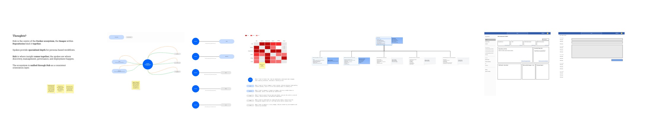
I created a series of diagrams and rough wireframes to explore the concept. Those early visuals helped clarify the structure and surfaced new questions. I shared them with designers, engineers, PMs, and folks in leadership to get feedback and see what resonated.
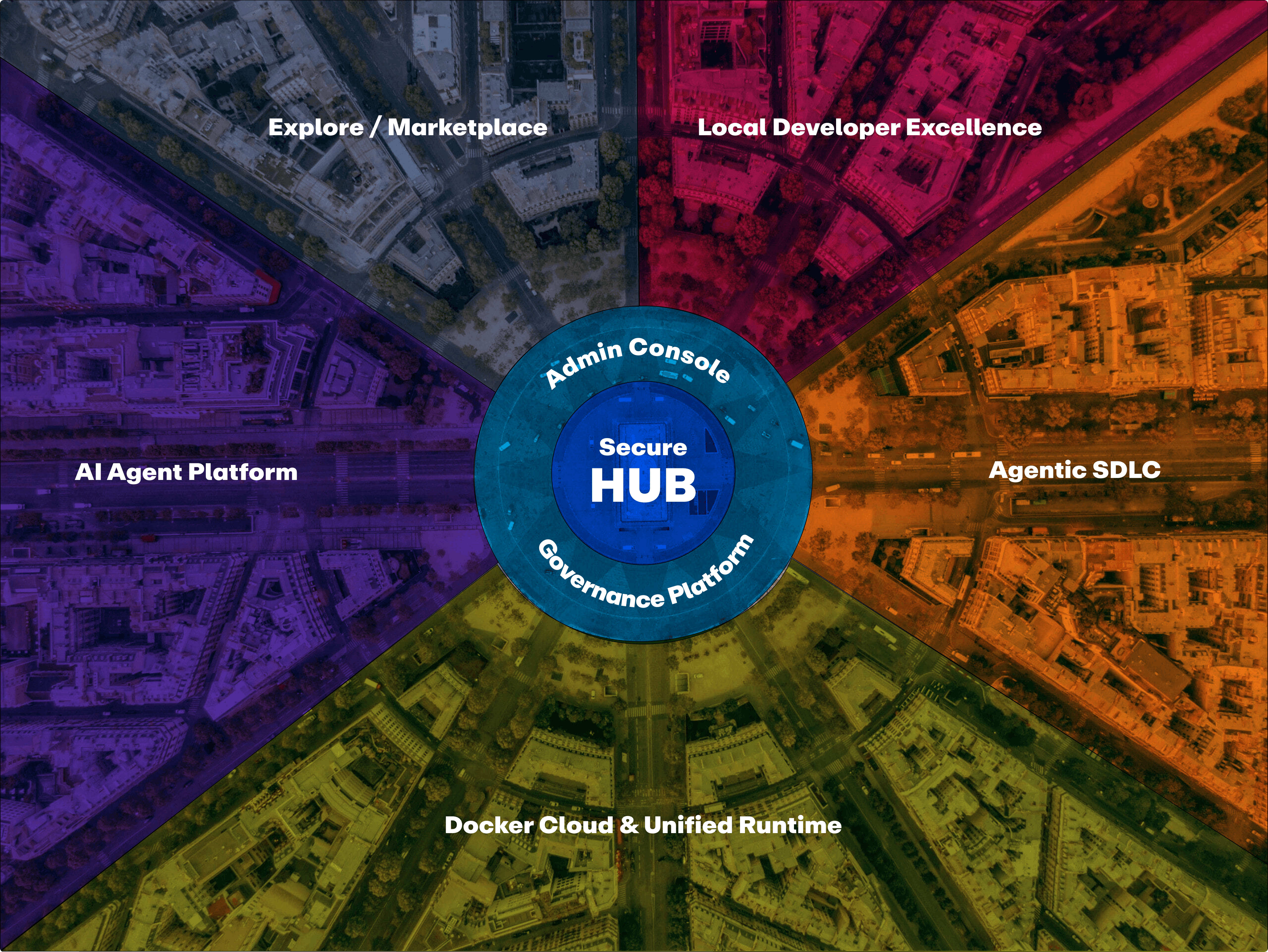
The model I kept coming back to was a city. Hub acts as the center, where users arrive, understand their current state, and decide what to do next. Admin becomes the layer for governance. The rest of the tools function like neighborhoods where focused work happens. Users move outward to do their work, then return to Hub to understand outcomes. This structure scales with the platform without adding unnecessary complexity or fragmentation.
As I was sharing this model, I learned that our Growth team had independently arrived at the same idea and was proposing something very similar in their 2026 plans.
I brought this back to the team and received buy-in. There was feedback and iteration, of course, but the next step was clear. Turn this into a proposal and start the roadshow.
That’s where we are today. We’re pulling together the proposal, refining the narrations, and keeping the Growth team closely aligned.
There is a lot more to this story, and it could easily be much longer.
This was my third or fourth time being involved in some form of vision work around Hub, but it’s the furthest any of those efforts have gone. When I reflect on why, it comes down to the human side of the work. Talking outside of your immediate group. Sharing ideas early with PMs, engineers, designers, and leaders both inside and outside your product area.
Every conversation added a small piece of signal. Those micro exchanges shaped the direction, challenged assumptions, and pushed the work forward in ways no single document ever could.
While the broader Docker vision is still in the proposal phase, we were able to get a meaningful portion of the Hub work into the roadmap for this year. That alone made this effort feel different, and worth it.